Back when I lived in California, I had the pleasure of teaching a couple of workshops on general drawing and sketching for character design. Here is one of the bits of info I used to give out at the start of the workshop to make sure we all had more or less the same vocabulary when talking about the elements of our character sketches. Sharing them here in the hope that someone finds it interesting or informative.
________________________________________________________________________________
________________________________________________________________________________
First, let's define each of these terms. These terms are not all universal, and some change from studio to studio, but they all exist no matter what you call them. For the purposes of our communication, I will attempt to define them to unify our collective understanding in this course.
Pose,Gesture, Silhouette, and Line of Action:
Pose is probably the most common term on the list of things we will discuss here. The pose is simply the position of character at the moment you're depicting in your drawing.
Gesture is the "rhythm" or "flow" of a character in the pose. Gesture is the “backbone” of the pose, and is the essence of the communication the artist has with the viewer through the look of the character. The gesture drives the energy of the pose.
The Silhouette is the outline of your character. Clarity in the silhouette is very important, especially if your goal is communicate an emotional state for your character(s) with the viewer.
The line of action describes the main action line of a gesture. It is important to note, action lines that can travel from one end of a character to the other (head to feet etc.)can usually be read very clearly, but action lines can also be broken up into segments if the pose calls for it.
The above image from the classic Tom N' Jerry Cartoons shows line of action as it relates to clarity in a pose.
This image shows some of the ways Disney artists were instructed to think about line of action, gesture and pose clarity.
Finally, this image shows three distinct poses with very different silhouettes (blue) but similar gestures (green) and lines of action (red)
Composition, Staging and graphic/dimensional design:
Composition as it relates to thinking about the characters we will work on, is based on two major factors. Firstly, where you place the character in the space of your image and secondly, the angle from which the character can be viewed.
Thinking about where the character will be situated in the flat space of the drawing and the angle from which it will be viewed is called staging.
For example, a big, strong character might be viewed from a lower angle and placed to take up a lot of vertical space in your 2D composition. This can give the viewer a perspective resembling that of a child. Conversely, a frail character might be depicted with a lot space between the top of the head and the top of the frame to indicate to the viewer the character is less imposing.
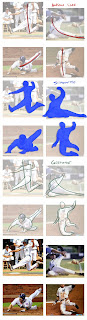
Below are some images of baseball players sliding into bases. Evaluate the gesture from these camera angles and you can see which poses have longer gesture and action lines. Could each of these poses be made stronger or weaker depending on the viewing angle? Let's combine the notion of Composition (where we see the character from as a viewer) with the ideas from above like pose and gesture (what the character is doing) to examine which of the images below most clearly communicates the action of a baseball player sliding in to a base. Which of these seems most clear given the silhouette (blue), line of action (red) and gesture (green). Can you see how the angle from which we see the player contributes to clarity of these elements?
Another factor that can contribute to composition choices is how graphic the style you're working in is. When you are working graphically, the number one concern is making appealing shapes that have great gesture and rhythm specifically from the angle of the viewer, even if it means you couldn't turn all the shapes in the round like a sculpture. Graphic shapes can have great appeal, but can be tricky to interpret in a dimensional way.
First, here are some extremely graphic designs.
Carlos Grangel
Ben Balistreri
Craig McCracken
Dave Guertin & Greg Baldwin (aka. Creature Box)
Some of us think more dimensional than graphically -- meaning we think about solid construction and how a shape might turn "in the round" like a sculpture. There is no inherently better choice when it comes to thinking dimensional versus thinking graphically. If you want to work on a project that calls for one style, and not the other, then one choice become more appropriate for that particular project, but neither is inherently good or bad, right or wrong.
Now, let's look at some less graphic and more dimensional examples:
Glen Keane
Milt Kahl
Also, please don't be confused by how shaded or rendered a shape as it relate to its graphic or dimension qualities. For example, the beautiful Creature Box art often has shading, but is also often very graphic in nature, while drawings by the late, great, Milt Kahl are usually all line with very little shading, but are totally turnable.
I mentioned above that "turning" graphic shapes can be VERY tricky. Well, here are some examples of artists who excel at this ( we will look at their work more in depth in class). These sculptors have made careers out of being able to find the essence and appeal in a graphic design and retain that spirit while turning them and making them more dimensional (look these people up!): Kent Melton, Michael Defeo, Andrea Blasich, Damon Bard, Vicki Saulls, Alena Tottle.
Proportions:
The term proportion describes the relationships of the parts of the character relative to the "whole." This is another common term, most of us already understand, so I wont dwell on it here too much. If however, you are unclear on this, PLEASE let me know in class!
There is a saying in design, the lesser is to the greater, as the greater is to the whole. What this means is, no part of our character designs works in isolation of another part. A change to one part can have a ripple effect that impacts the entire rest of the model. This should ALWAYS be taken into consideration. Too often some comment is tossed out about making the "eyes bigger" or ears flatter etc. without considering how that might impact other elements of the overall design. It's OUR RESPONSIBILITY to consider all the elements and how they balance out. Here are some alterations to the proportions of the creature I'll demo for the class, each throws the character out of balance in a different way:
Choosing how the elements are arranged is a fundamental part of design.
Expression:
For our purposes we will use the term expression specifically when talking about the character's facial poses. Examining what goes into an expression is one of the most clear ways to describe the emotional state of a character to a viewer. We are all trained to pick up on subtle facial clues that can hint at masked emotions as well. When evaluating an expression for animation, one thing to consider is how much squash and stretch the animation style will require. In nature, our bones are pretty rigid, and only the muscle and fat layers deform, but animators typically squash and stretch even the most rigid of characters.
Here are some AMAZING expression sheets by Glen Keane for Tangled (very dimensional).
And here are a few by Nico Marlet for the Kung Fu Panda films (Very Graphic).
Here are a couple of examples of squash and stretch in the face.
Clarity:
The ability to communicate visually in a manner that is quickly understood by the viewer is what I mean when I say clarity. The attempt to create clarity creates one of the most challenging dichotomies for most character designers. Most of what we have discussed above are tools we will try to use to achieve a sense of clarity. Here is what I mean:
When using clarity as a barometer, you can take seemingly subjective artistic judgement, and make them obviously objective in nature. Let's take a look at what I mean:
Above is an image of similar poses of my creature running. At first glance, it may appear the poses are too similar to warrant thinking about the difference between the two. So, which pose is "better" seems totally subjective.
If we use clarity as the barometer by which we measure the silhouette of the two poses, we can see the top pose is able to be read more quickly.
Why is this the case? Because the line of action in longer and uninterrupted in the top pose.
This leads to a more cohesive gesture where the pose can flow both vertically and horizontally.
This also clarifies the negative spaces around the character making the pose even more readable.
Costume:
We all know what the term costume means, but just in case, it's the consideration of what your character is wearing ( or not wearing). But, if we think about costume as a communication tool, it is a very big deal and can say SO MUCH about your character. Things like time period, culture, economic level, social status, gender, ethnicity, history, intentions, etc. can all come from costume.
Here are some designs from various films and games. Look at the impact the costumes have on what your thoughts about who the characters are and the settings in which they live.
Rango -- does this guy live in the 1960s, 70's or 80's? Or, perhaps he's from a much older time
Leafmen -- Can you tell these guys are close to nature?
Gears of War -- Is this guy a ballerina?
Wild Star: I wonder if this guy can change a lightbulb?
Costume choices can be overwhelming to think about, and to draw. In terms of thinking, research is KEY to making good choices related to communicating things about the character to the viewer. DO YOUR RESEARCH! I love pinterest for this kind of thing. We can look at some of the boards I've created in class, and I can show you what a GREAT research assistant it can be.
When it comes to drawing out the costumes, people can get overwhelmed easily when thinking about the rendering of various textiles, materials, fabric, patterns etc. One easy way to get moving on this is by creating "paper dolls." Paper dolls is a term used to describe quick attempts at describing different costume choices over a single figure. The ability to mix and match those choices is a huge bonus to the production and allows everyone to have a good look at what the intentions are for the wardrobe design. After you finish stressing out about what scarf to toss on your character, THEN worry about how to draw said scarf, but make the choice first by paper-dolling.... :-)
Here are a few examples of paper-dolling.
Things like a hoodie or scarf that is flowing can be more expensive in a 3D production because someone will have to rig, animate, and/or simulate the model. Most of the time, that's an accept cost for main characters, but for background characters it can be tricky to find the money to make these things happen. Paper-dolling is a low cost way for people to discuss these issues as well talk about the style and design of the clothing.
Model Sheet/Turnaround:
A model sheet or turnaround is the term used to describe a collection of images used to describe the look of a character in the round. Model sheets can include the entire character, or specific parts may be broken up into separate sheets in order to isolate those parts. This kind of thing is becoming less common in a lot of film and game production, but it is useful for the times when it is needed and helps you develop your ability to think and draw in the round.
Above is a "classic" style Disney model sheet turning and simplifying the character in a turn with a few poses as well.
This classic Warner Bros. Model sheet shows several poses as well as turns for the entire character. That is a LOT of info on one sheet.
Below, Meg from Disney's Hercules is broken into several images for a turnaround and views of multiple features like her hair and eyes. If you were a production artist, which method would you prefer -- single sheet or multiple?
Finally, here is a model sheet we will look at in class for a short film I worked on briefly. Modern model sheets are often created using this "T-pose" because it's the default pose a model is usually made in to facilitate easy rigging and animation in many 3D pipelines. We'll talk about the exciting particulars of that as well. :-P
I'm sure as the class progresses, we will get into even more terms , these are some of the core ones I wanted to discuss so you know what I'm trying to communicate to you when I use them. See you in class!


